A refined visual identity for RPO
The RPO is the cooperation and coordination body for the regional public broadcasters in the Netherlands. The RPO strengthens news and information provision and the role of regional broadcasters as cultural carriers. The regional public broadcasters are the news and information channels in their regions.
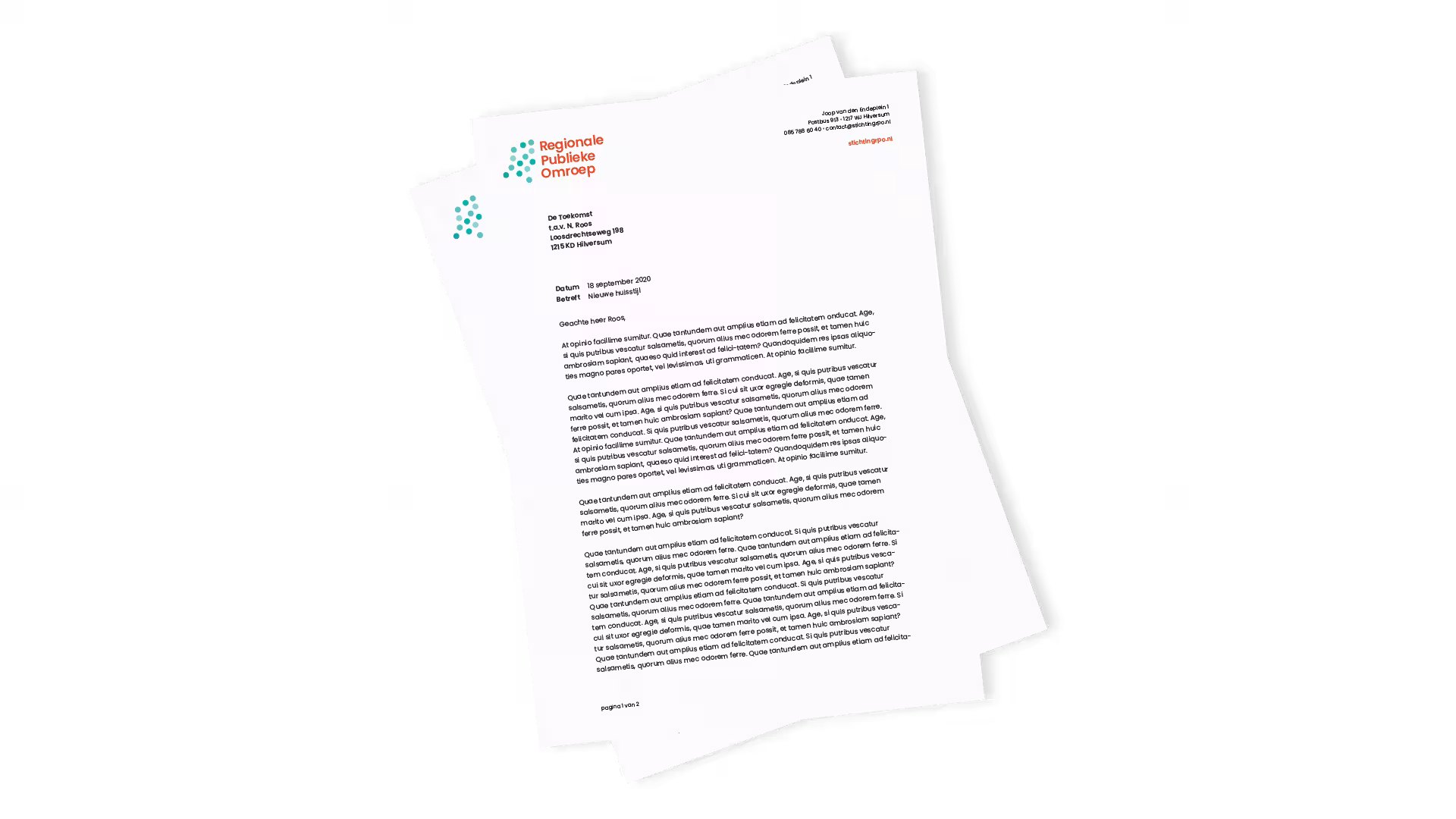
We have already had the opportunity to create many communication materials for RPO. For example, we designed both an interactive annual report and an interactive budget report. Our design studio also refined the visual identity, including the logo, typography and colours. We translated the renewed visual identity into various printed corporate materials, a PowerPoint presentation, newsletter, annual report, budget report, social media templates and, of course, the website.
Reason for refining the visual identity
Over the past few years, Stichting Regionale Publieke Omroep has positioned itself strongly in the market and wanted to take the next step with its visual identity. The visual identity consisted of various types of expressions, and there was a need for a more uniform and modern style. One of the goals was to create a connecting factor across the entire sector with a recognisable visual identity. De Toekomst developed and designed a refined visual identity for this purpose.
In short, a client with a strong vision and great assignments.
It is a pleasure to work with De Toekomst. They are flexible, careful, highly customer-focused and creative. De Toekomst delivered excellent work in refining our visual identity. The RPO feels fresh and contemporary again, while still remaining recognisable. Exactly what we were looking for.
Research and Communication Team – RPO